Original concept / Community outreach
Good things
start locally.
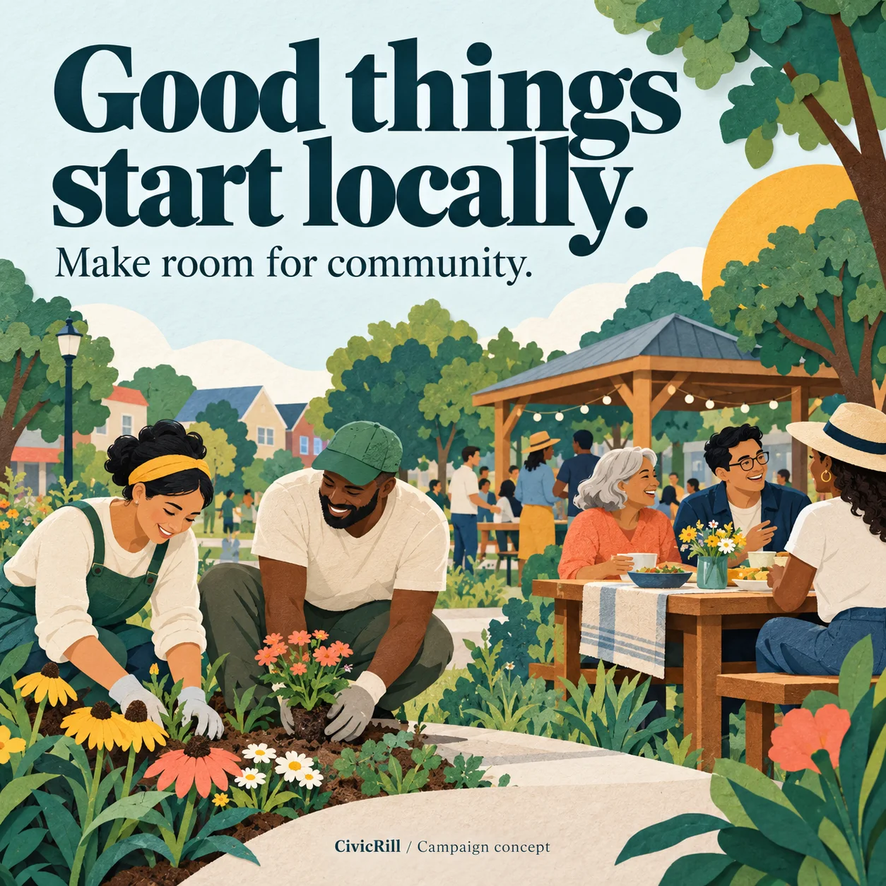
A warm, illustration-led direction for a community participation campaign. One invitation, carried consistently from the poster to the social feed.
The communication challenge
An organization wants people to feel welcome and understand how to take part. The visual direction needs to feel human while leaving space for the practical information that makes participation possible.
The design approach
A short invitation leads. An original community illustration adds warmth. A restrained palette and clear hierarchy keep the message recognizable across formats.
How it becomes a real campaign
Add the approved event details, participation requirements, accessible contact route and registration destination. Then adapt the layout for a flyer, newsletter block and selected social sizes.
The sample deliberately contains no invented event date or working registration offer. A real campaign would need those details before publication.
Ask about a campaign like this →What can carry across the set
The illustration, headline treatment and color palette can connect the materials, while each format has its own reading order. The poster earns attention; the newsletter explains the invitation; the destination page holds the complete, current details.